Creating
Interactive Worksheets Using Excel
Laura
McSweeney
Technology, Pedagogy and
Course Redesign III
June 11, 2003
lmcsweeney@campus.fairfield.edu
www.faculty.fairfield.edu/lmcsweeney
Here are the step-by-step instructions (for PC’s) to create basic sliders to adjust the slope and intercept of a line using the built-in features of Excel. The methods demonstrated here can be used to create many different interactive worksheets.
1.) Add the Forms Tool Bar by selecting View/Toolbar and clicking on Forms.
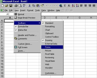
This will add the Forms Tool Bar which looks
like
 .
.
2.) Add a slider bar to
worksheet. Highlight the slider bar
icon ![]() on the Forms Tool Bar
by clicking on the icon. On the
worksheet, click and drag your cursor to create a slider bar.
on the Forms Tool Bar
by clicking on the icon. On the
worksheet, click and drag your cursor to create a slider bar.

3.) Set the control parameters for the slider.
Place cursor over slider bar and right click.
Select Format Control.
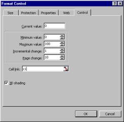
This particular slider
will control the value in cell C1 (designated by Cell Link) and the values will
change from 0 to 100 in increments of 1. Each click on the arrows on the ends
of the slider will change the value in C1 by 1 while each click within the
slider bar will change the value using a step size of 10. The minimum and maximum values must be
integers between 0 and 30000 inclusive.


4.) Since the value in C1 can only be a positive
integer and we want allow the slope to take on values between –10 and 10, we
will define the slope to be in cell B2 = C1/5 – 10.
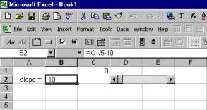
5.) Repeat
steps 2 – 4 to create a slider for the intercept. Here the second slider controls the value in C2 and ranges from 0
to 20 and the intercept is defined in cell B3 = C2/2 – 5.
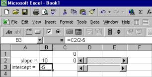
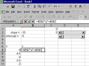
6.) Create the data set you will plot. For this
example, the x-values range from –5 to 5 and the y-value = slope * x-value +
intercept. To fix the slope and
intercept to the values in cell B2 and B3 so that they do not change when
copying the formula, type F4 after typing B2 and B3. The formula is copied to generate the remaining y-values.
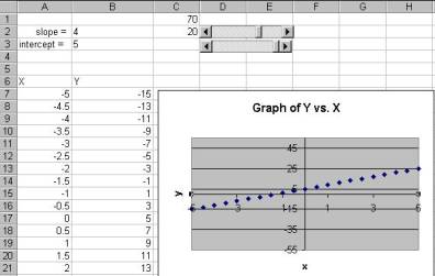
Generate the plot of Y vs.
X using Charts/Scatterplot. I fixed the
axes by right clicking on each axis, and selecting Format Axis. Go to the Scale
tab and uncheck the Auto Max/Min values. Be sure to set the Max/Min range that
will accommodate the data for all slopes and intercepts.
7.) To add a place to put your comments/questions,
click on the Text Box icon ![]() located on the
Drawing Toolbox to click and drag to form a Text Box. You can then type in any comments/questions you wish in the Text
Box by clicking in the box and typing. You can adjust the font and color of the
text by right clicking and selecting Format Text Box and selecting the color or
font. To change the background color of
the Text Box, right click on the border of the text box and select Format Text
box and choose the Colors and Lines tab.
Change the Fill color to your desired color.
located on the
Drawing Toolbox to click and drag to form a Text Box. You can then type in any comments/questions you wish in the Text
Box by clicking in the box and typing. You can adjust the font and color of the
text by right clicking and selecting Format Text Box and selecting the color or
font. To change the background color of
the Text Box, right click on the border of the text box and select Format Text
box and choose the Colors and Lines tab.
Change the Fill color to your desired color.
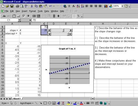
8.) Use Format/Cells and select the Font tab to
select the color of the text you want to see. Use Format/Cells and select the
Patterns tab to select the background color for cells for which you want to
hide the text. Here I made the text in
cells C1 and C2 (the “dummy” slider values) white so that they would not be
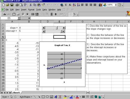
visible on the final page, shown in the figure to the right.
